Find: Famous Subway Maps, Reimagined as Vintage Super Mario Brothers Games

What is it about this that is so compelling?

Maybe maps should be more fun. 

*** 

Famous Subway Maps, Reimagined as Vintage Super Mario Brothers Games
// Latest Posts | The Atlantic Cities

Combining the systematic designs of urban transit systems with a bit of 1980s video gaming nostalgia, graphic designer Dave Delisle of Dave's Geeky Ideas has designed a series of metro maps implanted into the aesthetic of the classic video game Super Mario Brothers 3—which the designer has labeled "Mariotography."

In Delisle's schematics, graphic designer Lance Wyman's famous map of the D.C. metro, among other famous designs, are retrofitted with the video game's archetypal 8-bit landscapes of toadstools, Koopa Troopas, and, of course, Peach's Castle. Imagine traversing the Forest of Illusion while heading to downtown Montreal!


Métro de Montréal

While circles and shapes often indicate transfer stations and terminals on many subway maps, the recognizable symbol for Super Mario World's dungeons and Princess Peach's Castle—the immediately recognizable impetus for Mario's journeys—are substituted for the former and the latter. On a few station terminals, you can see the familiar SOS speech balloon from Peach herself. The famous green plumbing pipes that allow Mario to traverse between levels in the video game stand in as symbols for connecting commuter rails.


Washington Metro

Delisle also translates the logos of city transit systems to fit with the aesthetic, as though each system is the name for different Mario world. The Washington Metro becomes "Super Metro," Atlanta's MARTA features its tri-color stripes and the confident Mario iteration used when completing a level, while Portland's Tri-Met light rail dons the sizzling Fire Flower.


San Francisco BART

For San Francisco's BART system, Delisle changes the design entirely to that of Super Mario Kart to cleverly layout the routes of MARIO BART.


Toronto TTC/Subway RT

Delisle's highly-detailed maps have been a smash with both gamers and designers, spawning similar versions of the New York City Subway, Chicago "L", and the London Underground. They also have us wondering what the automated voices on subways cars would say for each: "Take the Orange Line to battle Bowser"? "Transfer here for Mushroom Kingdom"?

Dave Delisle's designs are available for purchase as posters on his website.


Portland TriMet


Atlanta MARTA


Calgary C-Train

This post originally appeared on Architizer, an Atlantic partner site.

Find: Google to buy Nest for $3.2 billion

Pretty big deal. Experientially, not a good match. Does my search engine need to know which room I'm in at home? But google has always been interested in energy. 

*** 
 
// published on Ars Technica // visit site
Google to buy Nest for $3.2 billion
Jacqui Cheng

Google announced on Monday that it has entered into an agreement to buy Nest Labs, Inc., makers of the Nest learning thermostat and Nest Protect, a connected smoke detector. The deal will cost Google $3.2 billion and should close in the next few months.

Nest has always been on Google's radar. Google Ventures, the company's startup investment arm, was one of the Nest's early investors. Google was previously rumored to be building a Nest thermostat competitor, and there were even leaked screenshots of a smart thermostat app built by Google called "EnergySense," which would let you control the temperature from a smartphone or Web client.

Now that Google is buying its main theoretical competition in this area, it's unclear what will happen to Google's internal projects. The one thing we do know is that the Nest brand will be sticking around, and the CEO of Nest, Tony Fadell, will continue to run the company as a separate division in Google.

Read 3 remaining paragraphs

Find: Pebble Steel hopes to deliver the same experience in a new stylish body

Huge. 

*** 
 
/ published on Ars Technica // visit site
Pebble Steel hopes to deliver the same experience in a new stylish body
Jason Inofuentes

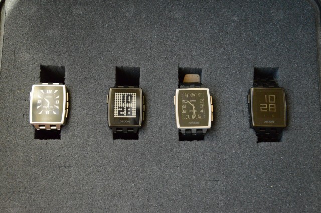
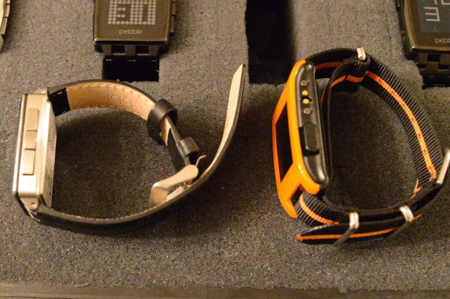
When we last visited Pebble, we suspected that the startup was at least a few months away from updating its hardware. It turns out we were wrong. Announced today and available to order, Pebble is unveiling its latest revision, called Pebble Steel. Housing the same internal hardware (including the same e-paper display), Pebble Steel features a more traditional watch design while being smaller and thinner than the original.

The Pebble experience remains mostly unchanged. The same size display and identical internal silicon means developers have nothing to modify in their Pebble apps, though it launches with SDK 2.0 so apps based on earlier SDKs will be incompatible.

We had a few minutes to speak with Pebble founder Eric Migicovsky about the new hardware's development, and we were impressed to discover that work on a refreshed design started just after the original began shipping to Kickstarter backers. Early criticisms focused on the size of the device, particularly its length, and the inability to pair the device with dressier outfits. The original Pebble's design is unabashedly chunky, and the glossy plastic fits in well with jeans and a hoodie. Worn with a suit though, the Pebble stands out awkwardly. Pebble Steel, especially with an analog watch face, looks like a traditional watch.

Read 3 remaining paragraphs

Find: New Oculus prototype features positional tracking, reduced motion blur

Interesting. Each image is spiked for just a few ms every 16 ms. This apparently reduces perceived blur due to retinal persistence: previous image doesn't overlap next. 

*** 
 
// published on Ars Technica // visit site
New Oculus prototype features positional tracking, reduced motion blur
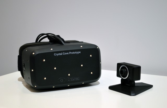
Those white dots are key to making the new Rift prototype a huge leap over previous models.
Oculus

At CES this week, Oculus VR is showing off a new prototype of its Rift headset, dubbed “Crystal Cove,” that incorporates a camera-and-LED system for head tracking and a quick-switching OLED display to reduce motion blur and increase image persistence.

The white dots on the surface of the Crystal Cove prototype in the image above are actually tiny infrared LEDs that send out signals visible to a camera specially designed by Oculus. This data is integrated with the gyroscope data that’s been in previous Rift prototypes to track your head’s absolute position and orientation as you crane your neck and lean forward, back, and side to side.

It’s hard to overstate just how much this changes the Rift virtual reality experience. Now, if you see something interesting, you can actually lean in to zoom closer to it. If you want to see the side of something sitting just in front of you, you can lean forward and around it and turn your head to the side to get an entirely new viewpoint. The environment no longer shifts with you, so to speak, when you shift your head around, as it did with previous Rift prototypes. Instead, the environment stays rock still and your virtual viewpoint is all that changes.

Read 4 remaining paragraphs

Find: Netflix's genre tags - a perfect example of experience analytics


// published on The Verge - All Posts // visit site
A quantum theory of Netflix's genre tags

Netflix's extraordinarily specific micro-categories have become both a running joke and a surprisingly effective recommendation tool, but how does it serve up personalized recommendations for "violent sci-fi thrillers" and "gory action and adventure," and why are "violent" and "gory" separate descriptors? And why, when you reverse-engineer Netflix categories as Ian Bogost and Alexis Madrigal did for The Atlantic, are there 19 genres dedicated to the man who played Perry Mason? By scraping the tens of thousands of possible Netflix categories (most of which users will never see), Bogost and Madrigal put together a strangely effective map of how Hollywood makes movies and how we seek them. And behind it all is Todd Yellin, the Netflix VP...

Continue reading…

Find: Internet Archive releases hundreds of classic game console ROMs

Sweet! 
 
// published on Ars Technica // visit site
Internet Archive releases hundreds of classic game console ROMs
Now this is real gaming.

Tired of that shiny new game console you opened up on Christmas morning already? Looking for gameplay that's a little more timeless? Maybe you just want to show your ingrate kids what gaming was like back when you were young. In any case, The Internet Archive has got you covered with dozens of emulated ROM images of games for classic game systems of the '70s and '80s running right in your browser.

Yesterday, The Internet Archive launched its Console Living Room section with games for five classic systems: the Atari 2600, the Atari 7800, the Colecovision, the Magnavox Odyssey2, and the Bally Astrocade. You can play dozens of games for each system right on the site through the Javascript-based JMESS emulator, which runs decently (but not great) in most modern browsers

The new section is an extension of the Internet Archive's existing Software Collection, which launched a few months ago with a limited selection of downloadable and browser-emulated games. The Archive has also long hosted downloadable ROM images for games from dozens of classic game systems through The Old School Emulator Center. There's also a healthy collection of over 4,000 classic PC shareware games and 2,500 PC-CD demo discs hiding among the Archive's massive collection.

Read 1 remaining paragraphs

Find: the oculus drums beat ever louder

It sounds impressive, but if you think Google Glass looks silly...

*** 
 
// published on The Verge - All Posts // visit site
Flush with cash, Oculus plans ambitious new VR headset

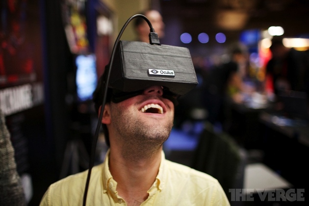
According to Oculus Rift inventor Palmer Luckey, virtual reality is near and dear to Marc Andreessen’s heart. Twenty years ago — before he created the Mosaic web browser — Andreessen was a college student working in a virtual reality lab, just like Luckey himself. But that’s not why the Andreessen Horowitz venture capitalist decided to invest millions of dollars in Oculus today. The company showed him a new version of the virtual reality headset — and a new vision — that reportedly blew him away.

"I looked at him and said, what do you think? Are you ready to change the world? And he said absolutely, let's do it. It was pretty much unanimous, right then and there," Oculus CEO Brendan Iribe tells The Verge.

Continue reading…

Find: data and visualization politics begin

An early example of what will soon be a flood of data rhetoric. 
 
 
// published on Latest Posts | The Atlantic Cities // visit site
Why New Yorkers Are Hating on the NYPD's New Interactive Crime Map

The New York Police Department unveiled a user-friendly interactive crime map last weekend. You can look at crime by precinct, by address, or on a heat map. One can also toggle between murder, rape, or a view that shows all seven major felony crimes.

The NYPD designed the interactive map at the behest of the New York City Council, and it's pretty good from a visual perspective. Yet New Yorkers aren't happy with it. 

Bronx Councilman Fernando Cabrera told DNAInfo that the map isn't at all what the council was talking about in May, when it mandated the NYPD to create a crime map. As you can see in the screenshot above, the NYPD's map doesn't contain important information like time and date, nor does it break out each incident with specific details. Cabrera added that the NYPD worked on the map "in obscurity," didn't keep the council updated on its progress, and ultimately has created a map that is "sub-standard to what you find in other states and in other cities, likes Chicago.” 

The other major criticism of the map comes from advocates for bicycle and pedestrian safety. The Village Voice argues that the absence from the map of vehicular injuries and homicides is "a giant, gaping blind spot in the data visualization." It's also in keeping with NYPD Commissioner Ray Kelly's views on traffic deaths. 

As Sarah Goodyear reported in October, Kelly believes prosecuting reckless driving is too complex. "Some people say that the police are not arresting enough people for reckless driving and that sort of thing. Well, you have to — and there are many court decisions that say this — you have to observe the violation," Kelly said at The Atlantic's CityLab summit. "It takes in-depth investigation and examination, it takes witnesses, it’s much more complex than you might think."

If the NYPD omitted vehicular homicides from its crime map because it doesn't have the resources to investigate all vehicular homicides as crimes, why not do the next obvious thing, and create a separate map? The city council held a hearing in October to discuss this very idea. The NYPD's position? We don't wanna. As Streetsblog noted at the time, Susan Petito, assistant commissioner of intergovernmental affairs for the NYPD, testified before the council that because vehicular accidents are cataloged by the nearest intersection, not the nearest address, the maps won't be useful or even all that intelligible.

When asked if the NYPD would like to join the council in finding a way to map vehicle incidents more accurately, Petito replied, "The utility of a street address, I can’t sit here and tell you that would add anything.”

Bicyclists and pedestrians just can't win with the current NYPD. 

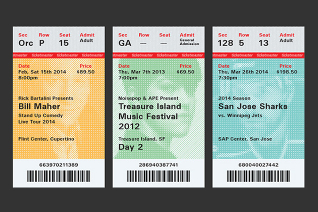
Find: making tickets more approachable

Well done. Note the use of color and blur to separate foreground from background. 

Let's make our more approachable. 

*** 
 
// published on The Verge - All Posts // visit site
The trouble with Ticketmaster is all the tickets

Graphic designer Matthew Lew likes concerts, but he hates concert tickets. A student from California College of the Arts, Lew was dismayed by the poor standard of design of tickets, both from an aesthetic and usability perspective. Rather than simply complain about it, he set about creating "a redesign worthy enough to keep paper tickets in circulation."

Continue reading…

Find: Motorola's Ara project will be good for company, user experience, us industry and planet: smart move


// published on The Verge - All Posts // visit site
Motorola CEO sees Project Ara as the future of Moto Maker customization

At the end of October, Motorola made a surprising announcement: it was working on an open-source initiative called Project Ara that would allow for the creation of modular, customizable smartphone hardware. It's an ambitious and seemingly unlikely project, but Motorola CEO Dennis Woodside says it's all part of a plan to make consumers more involved with building their smartphones. "Moto Maker was the beginning of a much more exciting and longer-term story," Woodside says in an interview with YouTube personality Marques Brownlee. "Ara is much further out, but you can see how those two things tie together, and how as we introduce new materials into Moto Maker we're gonna pursue that theme across our product line going forward."

"The line...

Continue reading…